
by Russell Grigg, PGCE Primary Director, Swansea University
Estyn’s annual report 2024-25 highlights that self‑evaluation is a challenge across ITE in Wales. This has been the case for many years. One key reason is the limited availability of consistent, high‑quality data which should underpin effective self‑evaluation. But there is some good news. We already have a tool which offers a shared, system-wide source of evidence to build our understanding of what is working well and what needs to be strengthened: the Professional Learning Passport (PLP). This blog shows why the PLP has significant untapped potential to support a more reliable, evidence‑informed approach to self‑evaluation across ITE.
The PLP: more powerful than it first appears
The PLP is Wales’s national digital platform for recording, organising, and reflecting on professional learning. For student teachers, it offers a secure space to upload evidence of their progress towards meeting the standards for Qualified Teacher Status (QTS). In our PGCE Primary programme at the Swansea University Schools’ Partnership, we have been exploring the use of PLP data to gain clearer insight into student teachers’ progress and how well they are supported by mentors.
To do this, we look more closely at what sits behind the PLP. Its workbook page quietly stores additional information uploaded by users. When analysed carefully, this data gives us a detailed view of how our partnership processes are working on the ground. Recognising this potential, we use PLP data more forensically to support programme‑level evaluation.
How we use the data: a simple step‑by‑step approach
-
Choose an improvement focus
Our starting point is to choose an area from our improvement plan. Because the consistency of mentoring quality is a strategic priority, this year we have focused on the formative targets mentors set student teachers after observing their lessons. We suspected these targets varied in quality, but we needed clearer evidence of the pattern: who was getting it right, where the gaps were, and where support should be targeted.
-
Download the relevant template
While mentors set targets in different contexts, our analysis centres on the formal lesson‑observation records, which we download as CSV files from the Workbook.
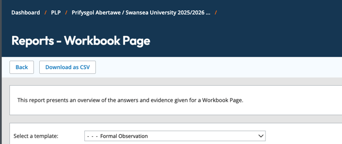
Figure 1. Workbook on the Professional Learning Passport.
-
Use Microsoft Copilot for rapid analysis
We then upload the CSV files to Microsoft Copilot and use a simple prompt such as: “Analyse the targets in column AD on the attached.” As with any use of generative AI, we approach the analysis with care, knowing that the outputs need to be checked for accuracy. We sense‑check the results by re‑running the query with slightly different wording, comparing the examples with the raw data, and verifying that no inaccuracies (‘hallucinations’) creep in. This helps ensure the analysis is as reliable as possible.
-
Explore the data in more depth
Depending on our query, we use additional prompts to dig deeper into the data exploring possible variations across networks, settings and individual schools. For example, we look at comparing targets in Welsh‑medium and English‑medium contexts. We also identify the most common targets set for student teachers so that we can ensure they are well prepared for the next placement.
-
Use the findings to refine practice
These insights help us shape university‑based sessions for the next placement, so that any pressing issues are addressed. We also use the findings when planning and running mentor development sessions and update our guidance to mentors. We create summaries of the data (Figure 2) and produce short reports so school network leads can use the information to inform mentor discussions within their networks to achieve our goal in raising the quality of mentoring.
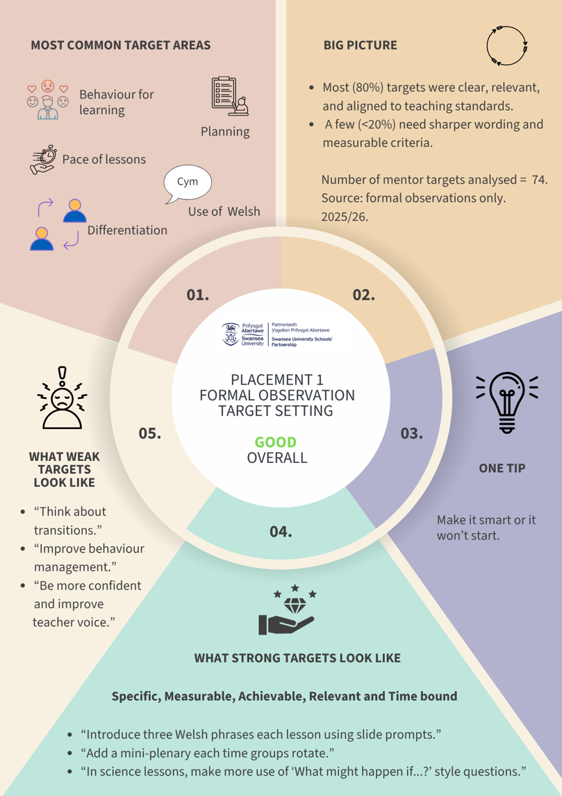
Figure 2. A visual summary of the data on mentor target setting for student teachers
-
Updating our programme enhancement plan (PEP)
Our programme enhancement plan is a simple Excel sheet that acts as a running record of decisions linked to our strategic objectives. It anchors our team meetings, helping us use PLP data to see what’s working, identify unanswered questions and agree our next steps.
The Value of the PLP
When used well, the PLP provides something we rarely have in ITE: consistent, real‑time evidence from every student in the cohort. It also alerts us to issues that could easily pass unnoticed. For example, several students repeatedly wrote task‑focused learning intentions (e.g., ‘To create a snow globe’, ‘To write an email to Amazon’). These statements described what pupils would do rather than what they would learn. Spotting this early meant we could provide targeted support and strengthen their approach to planning.
Just as importantly, the PLP helps us see cohort‑level patterns. Teaching hours data, for instance, allowed us to generate a heat map of the first five weeks of placement (Figure 3). The apparent variation was initially concerning. Closer inspection, however, showed that many gaps were caused by students not recording their hours as they should. A brief reminder corrected this and improved future monitoring.
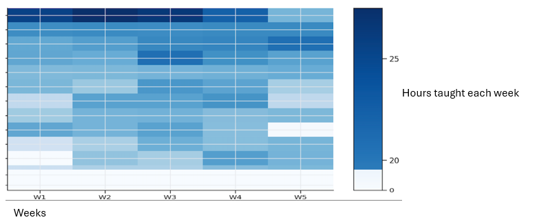
Figure 3. Extract of a Heat Map of student teachers’ teaching time. Each row represents a student teacher’s teaching hours.
These examples show how PLP data helps us identify both individual and wider issues, enabling faster and more accurate improvement. Of course, the quality of our analysis depends entirely on what is uploaded: strong inputs lead to strong insights; weak inputs do not.
Conclusion
We recognise that PLP data does not tell the full story. For example, in areas such as target setting some mentors give excellent verbal feedback that is not captured in the written record. For this reason, we use PLP data as a starting point for dialogue, not a definitive measure of quality. Nonetheless, the PLP brings coherence to a complex partnership system and helps us see patterns that would otherwise remain hidden. For our programme, it is already reshaping how we understand progress, how we support mentors and how we plan improvements. In a sector where self‑evaluation has long been a challenge, the PLP offers a realistic and sustainable route to stronger self‑evaluation and, ultimately, better support for our student teachers and school partners.